
Home About Me Resume
CASE STUDY
Across the Table: Bilingual Information Design
OCAD University · Collaborative research project · Bilingual content and information design · 2026
My role
Bilingual manual development · Information design · Digital and print delivery
Keep the clue usable across languages and formats
Across the Table pairs a screen with a printed notebook. The notebook carries information that the screen-side player needs to interpret household objects.
I led the bilingual manual development within a collaborative research project with Harvey Li. This case follows three content decisions: making clue instructions distinct, carrying their logic between Chinese and English, and preparing files for reading and print.
My lead scope: Bilingual game manual development; prototype concept, design and development
Shared work: Research, analysis, toolkit and final report with Harvey Li
Manual outputs: Chinese and English digital PDFs and print PDFs
What this case covers
I led the Chinese and English game manuals for Across the Table, connecting clue structure, a household-notebook voice, and digital and print delivery.
Give the clue a clear place in the notebook
I led a manual design that places operative clues inside an ordinary-looking household notebook.
The notebook has to do two jobs: belong to the fictional room and give its reader usable information. I grouped entries by household object and distinguished clue instructions from surrounding life notes through color, spacing and sequence words.
A concrete example is the calendar entry: the reader needs the number inside the red circle, while the surrounding notes keep the voice of an everyday household notebook. I separate the red instruction from blue life notes, and use “Next” to place it in the clue sequence. Color is not the only cue: wording, spacing and object grouping also distinguish the task. Some blue notes still help interpret the clue; blue does not mean irrelevant. The original paired calendar pages in the next section show this choice.
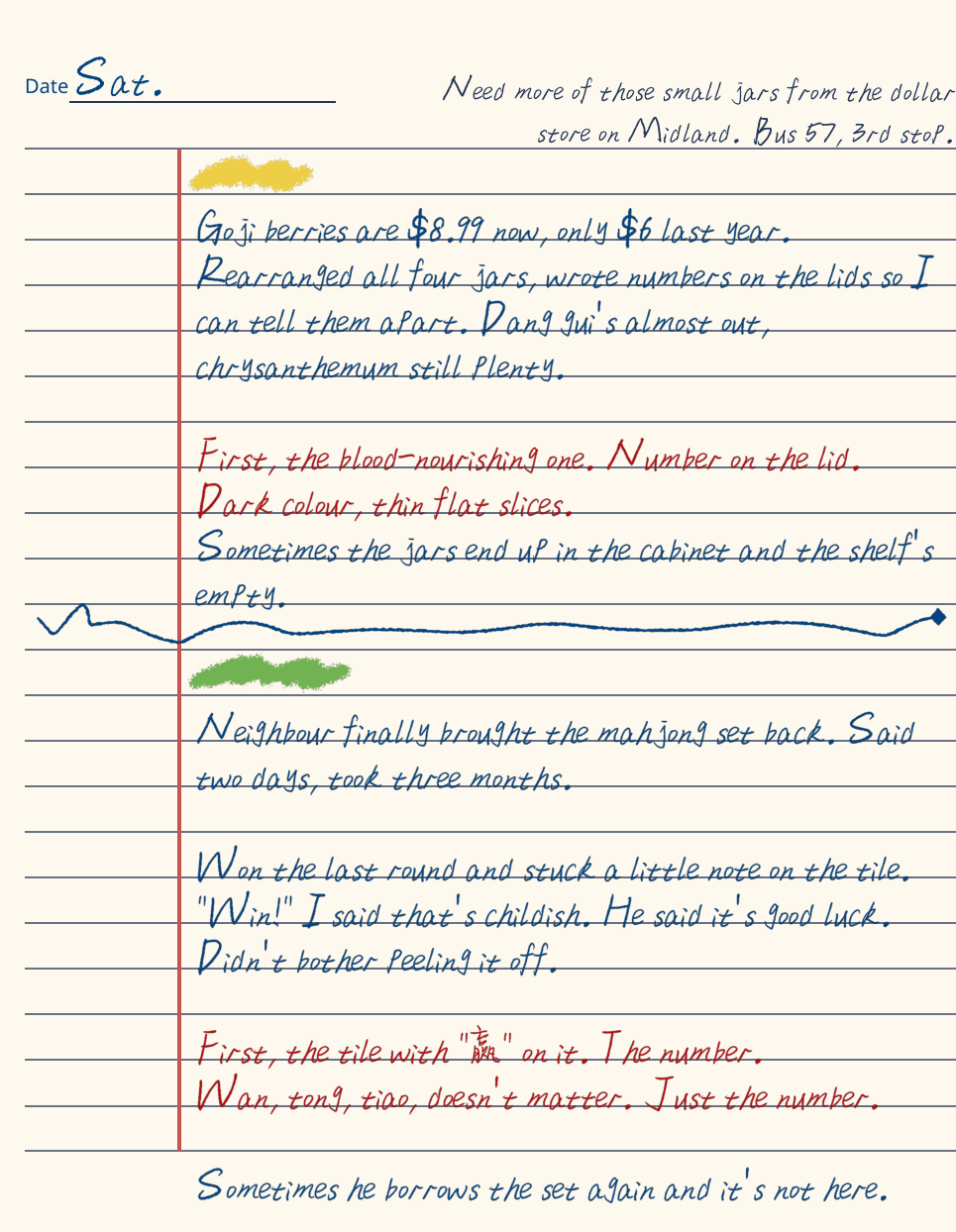
Published English manual, PDF page 4. Red instructions and blue narrative notes share a household-notebook layout.
I led a manual design that places operative clues inside an ordinary-looking household notebook.
I led a manual design that places operative clues inside an ordinary-looking household notebook.

First view


Second view

I led a manual design that places operative clues inside an ordinary-looking household notebook.
The completed pages place the key instruction in red and the surrounding notes in blue. Entries use first, then, next and last to indicate where a clue belongs in the password sequence. Object sections have colored marks and clear breaks on the page.
The herb and mahjong entries share a page because they occupy the same place in different puzzle configurations. The reader matches the object described by their partner to the relevant entry. Notes about an object being borrowed or moved provide a fictional reason that an entry may not apply in the current room.
These pages demonstrate the information structure I developed.
Carry the clue relationship across languages
I developed Chinese and English versions around the same objects, clue order and interpretation task.
The same calendar clue appears on physical PDF page 6 of both digital manuals. Chinese: “再看挂历。红笔圈的那个,是几就是几。” English: “Next, the calendar. Whatever’s circled in red, that number.”
Both versions identify the calendar, direct the reader to the red-circled number, and preserve the sequence cue through “再看” / “Next”. The English wording keeps the action rather than translating the Chinese sentence word for word. These original pages demonstrate the alignment of this clue.
The same calendar clue in the published Chinese and English manuals, PDF page 6 in each. Original pages are shown for comparison.
I developed Chinese and English versions around the same objects, clue order and interpretation task.
I developed Chinese and English versions around the same objects, clue order and interpretation task.
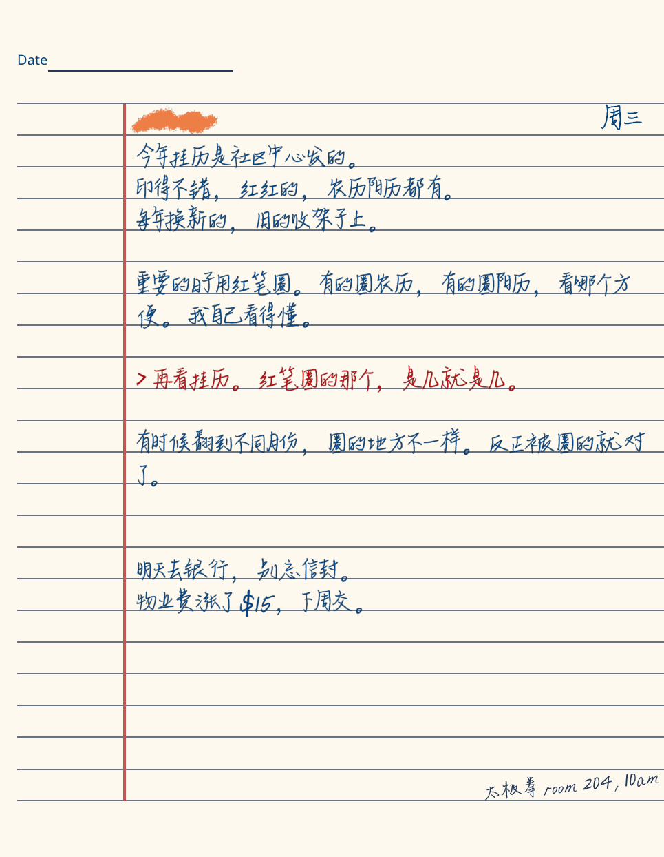
Chinese manual
“再看挂历。红笔圈的那个,是几就是几。” Calendar → red-circled number → next position in the sequence.
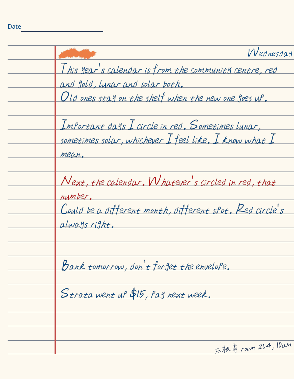
English manual
“Next, the calendar. Whatever’s circled in red, that number.” The object, selection rule and sequence cue stay aligned.
I developed Chinese and English versions around the same objects, clue order and interpretation task.
I used a parallel content draft to map the object, puzzle configuration, sequence position, manual wording and screen-side evidence. This kept the relationship between the two players visible while the writing changed.
Some cultural references remain in the English artifact. The mahjong entry retains the Chinese mark on the tile, and the envelope entry retains the written blessing phrases. This gives the reader a link to the object that their partner sees.
The matched calendar pages below are published artifacts. Their alignment demonstrates a design choice.
Prepare reading and print versions
I delivered the manual in Chinese and English, with separate digital-reading and print PDFs.
The archived Chinese and English digital manuals each contain 10 portrait pages; the print PDFs each contain 5 landscape spreads. The English print example shown here is physical PDF page 4: calendar on the left, photo and red-envelope entries on the right, with visible trim marks.
File page boxes are 965 × 1244 pt for each digital page and 2000 × 1294 pt for each print spread.
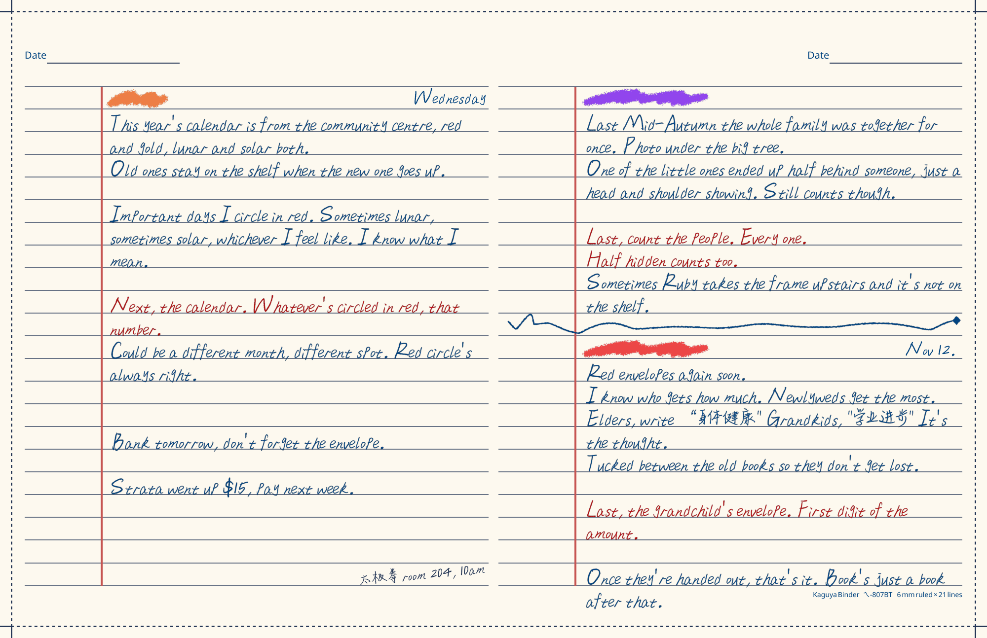
English print PDF, page 4 of 5. The spread places the calendar beside the photo and red-envelope entries and includes trim marks.
I delivered the manual in Chinese and English, with separate digital-reading and print PDFs.
I delivered the manual in Chinese and English, with separate digital-reading and print PDFs.
First view
Second view
I delivered the manual in Chinese and English, with separate digital-reading and print PDFs.
The manual is part of the interaction: one player reads it while the other works with the screen. Its page order, clue wording and visual references have to remain consistent with the puzzle configuration.
The archived files show the reading and print layouts.
The digital copies preserve the handwritten appearance as images.